A Brief Overview of Claude Design
The new design tool from Anthropic - and how it stacks up
Introduction
Claude recently released a new design tool, aimed at replacing Figma, Canva, and Google Stitch. Claude Design, although still in research preview, aims to let users create graphics, interactive animations, slides, and of course, mockups for web and mobile apps. I decided to try out this new tool, understand what features it offers, and evaluate how well it lives up to its aspirations.
First look
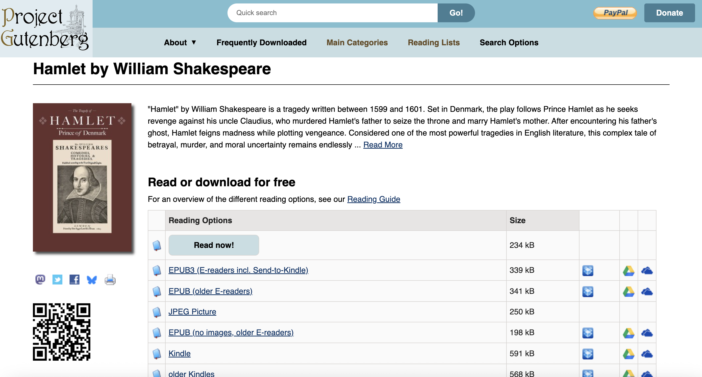
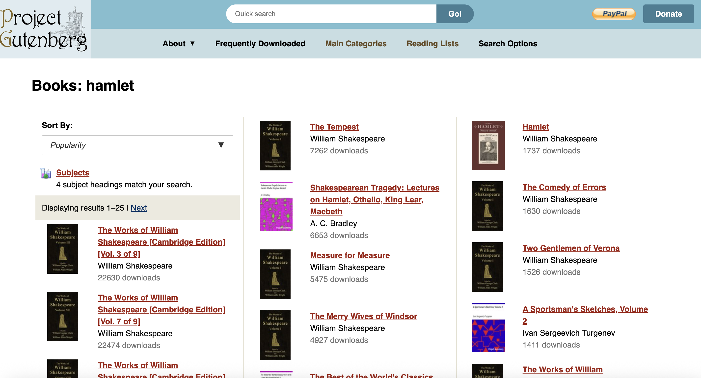
I wanted to try out Claude Design by redesigning Project Gutenberg, a website I use pretty frequently. Project Gutenberg is an online repository for free ebooks, many written by classic authors in the public domain, such as Shakespeare, Dickens, etc.
Although this is a great source for ebooks, the design is a bit outdated and not the most pleasing to look at, even if it is relatively usable. So I thought it would be a great candidate for Claude Design, since I would be able to judge whether the new design would work well for the existing site.
Claude Design also shows examples of other graphics it can generate. For example, animations, wallpapers, and loaders, but generating these seems a lot more straightforward, so I will skip them.
The Design System
While checking out Claude Design’s web app, I noticed that it has a prominent option for creating design systems, which I appreciated. When experimenting with AI design tools in the past, I noticed that they often jumped straight to cranking out a fully polished design from a prompt, and skipped the necessary task of specifying the fonts, colors, padding, and overall visual style. Creating a design system first can help you build those components that make up the overall look and feel of the app, and then you can tweak it as you like.
When creating a design system in Claude Design, you can describe your company name and blurb, and then upload files (figma, code, pictures from your computer, etc.), and provide instructions.
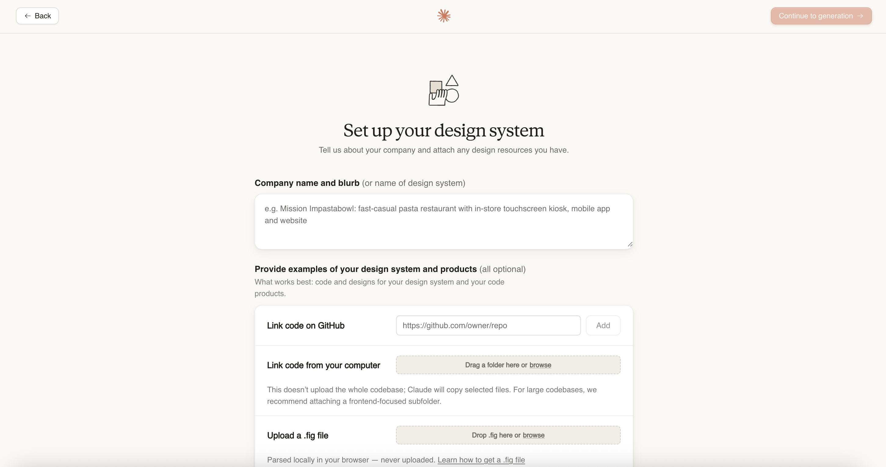
I wanted the site to feel simple, not flashy, and more conservative, so this is the prompt I gave when creating the design system:
functional minimalist, square corners, minimal shadows, compact, cool accent colors (light blues/greens), crisp/conservative/basic aesthetic.
Your results will be better and more in line with your vision the more specific you are. I kept my prompt pretty vague though, since I didn’t have a great idea at this point of what visual identity I wanted for the site. Screenshots of other sites or figma files would probably help as well.
After a few minutes, Claude outputs your design system, which is represented by a list of different design elements with their styling. You can click through all of these (spacing, colors, font, etc.) and write comments or provide feedback.
The output also provides a UI kit for “Marketing” and “App”. As far as I can tell, they aren’t really supposed to be finalized designs, but instead are more of a way to validate your design system by seeing how the different components look together.
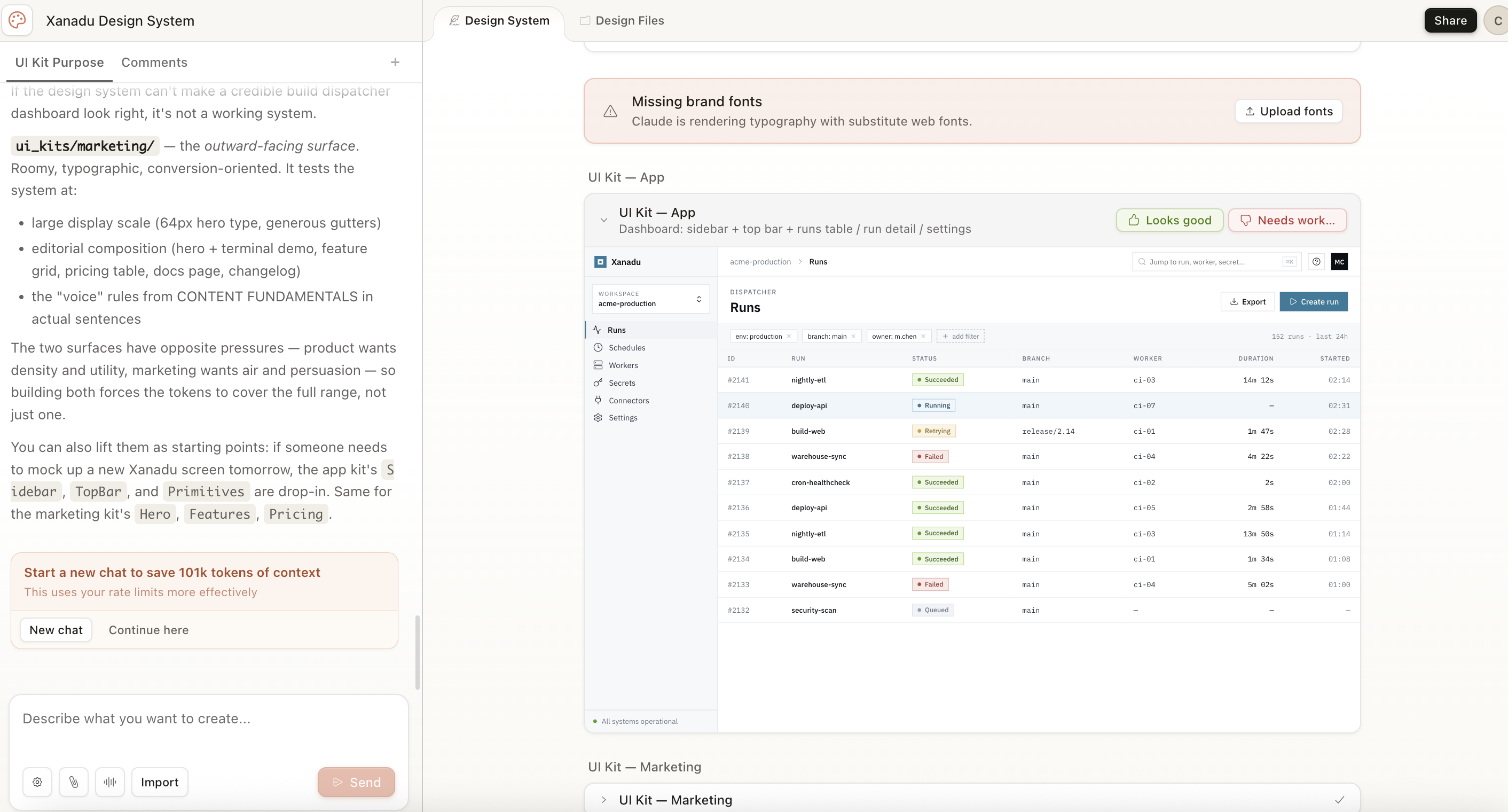
I’m a fan of the UI kits, since the individual design elements are often pretty abstract without context. I may have decided the colors, spacing, and buttons, but what do these actually look like in an app? This gives you more context.
Overall, I liked Claude Design’s flow so far, which is much more guided than other platforms I used in the past, like Google Stitch.
When finished, you can click the “published” button to reference this design when you start creating your mockups.
Creating a Mockup
Now that we’ve made the design system, we can start creating our mockup. When creating the new prototype, we have an option of selecting “wireframe” or “high fidelity”. I’m a fan of this distinction, since it’s a lot easier to quickly review and iterate on a wireframe without a lot of styling.
Creating a new mockup brings you to a page with a prompt window on the left, and a blank canvas. In the prompt window, you can attach design systems, screenshots, a codebase, or figma files to add additional context. Since I’m making this from scratch, I’m just going to use the design system I created earlier.
My initial prompt for creating my app wireframes was pretty basic, just describing the list of features I wanted:
Design a site similar to project gutenberg. It should be called Jest. Use the Xanadu Design System attached It should be an online repository of e-books that can be browsed by genre, author, etc. and then downloaded, or read in the browser. In should have the following core features:
- browse page. Here, you can browse books by searching, and you have filters for genre, date range published, etc. Paginated.
- book page. This is the page for a particular ebook. It will have the book cover, book name, meta information (date published, author, language, if it was translated, etc.) Importantly, it will have a few action items. To download the ebook in a number of formats (epub, plain text, html), and a link to read the book in the in-app viewer.
- book reader page. This will let the user read the book in an in app viewer. it should be relatively minimal, and have the expected features (next page, previous page, note taking, etc.)
- author search page. Similar to the book search page.
- author page. Shows meta information about the author, a picture, and a list of books they have on the jest platform that can be clicked to link to the book page.
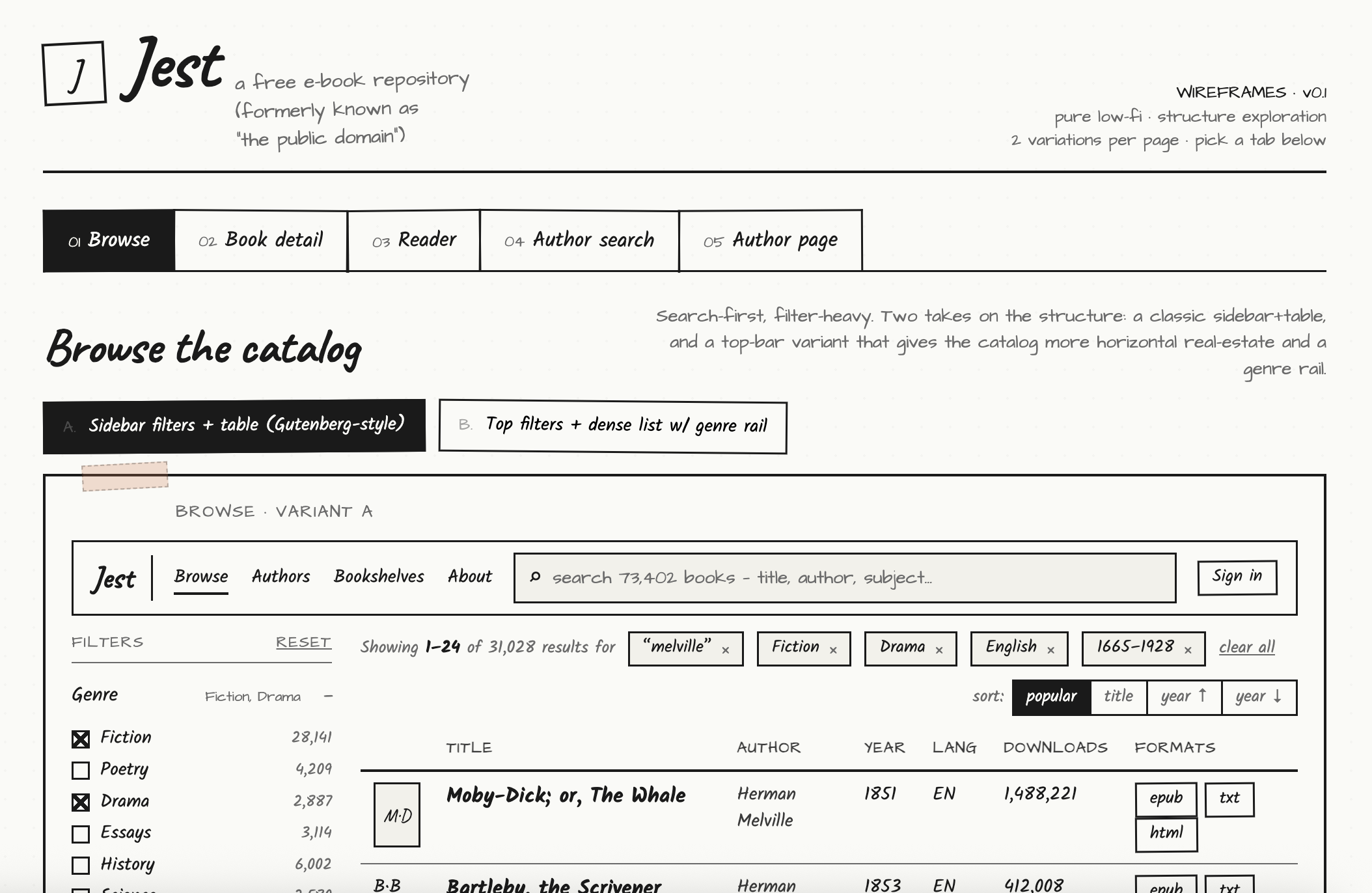
The app then spends a few minutes generating the wireframes from the description. You can also put further instructions in the chat sidebar to update specific pages, create new features, etc. It also asks a lot of follow-up questions for the wireframes. For example: how many layout variations per page, which page needs the most exploration, specific page questions etc.
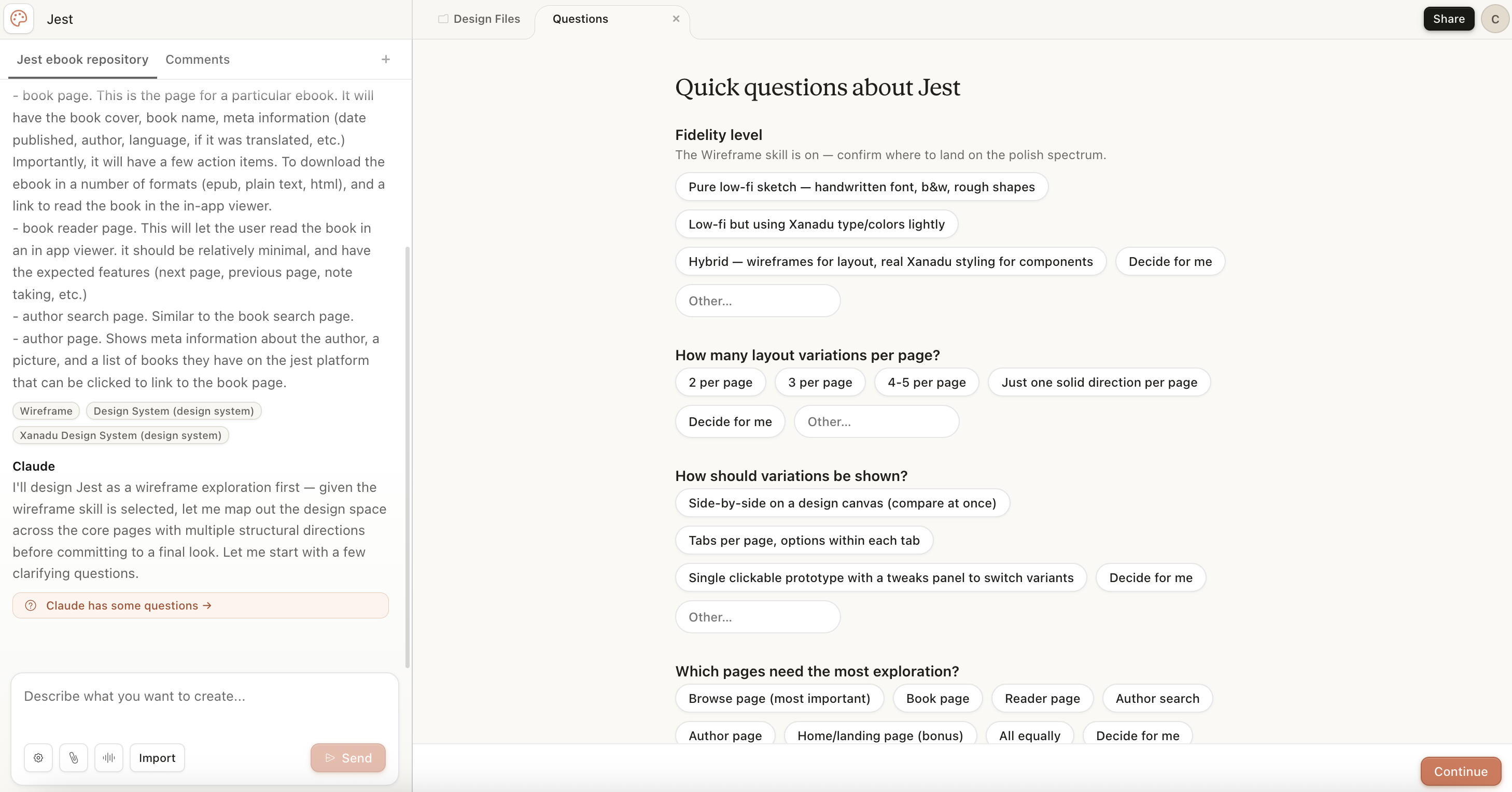
Here are some of the generated wireframes:
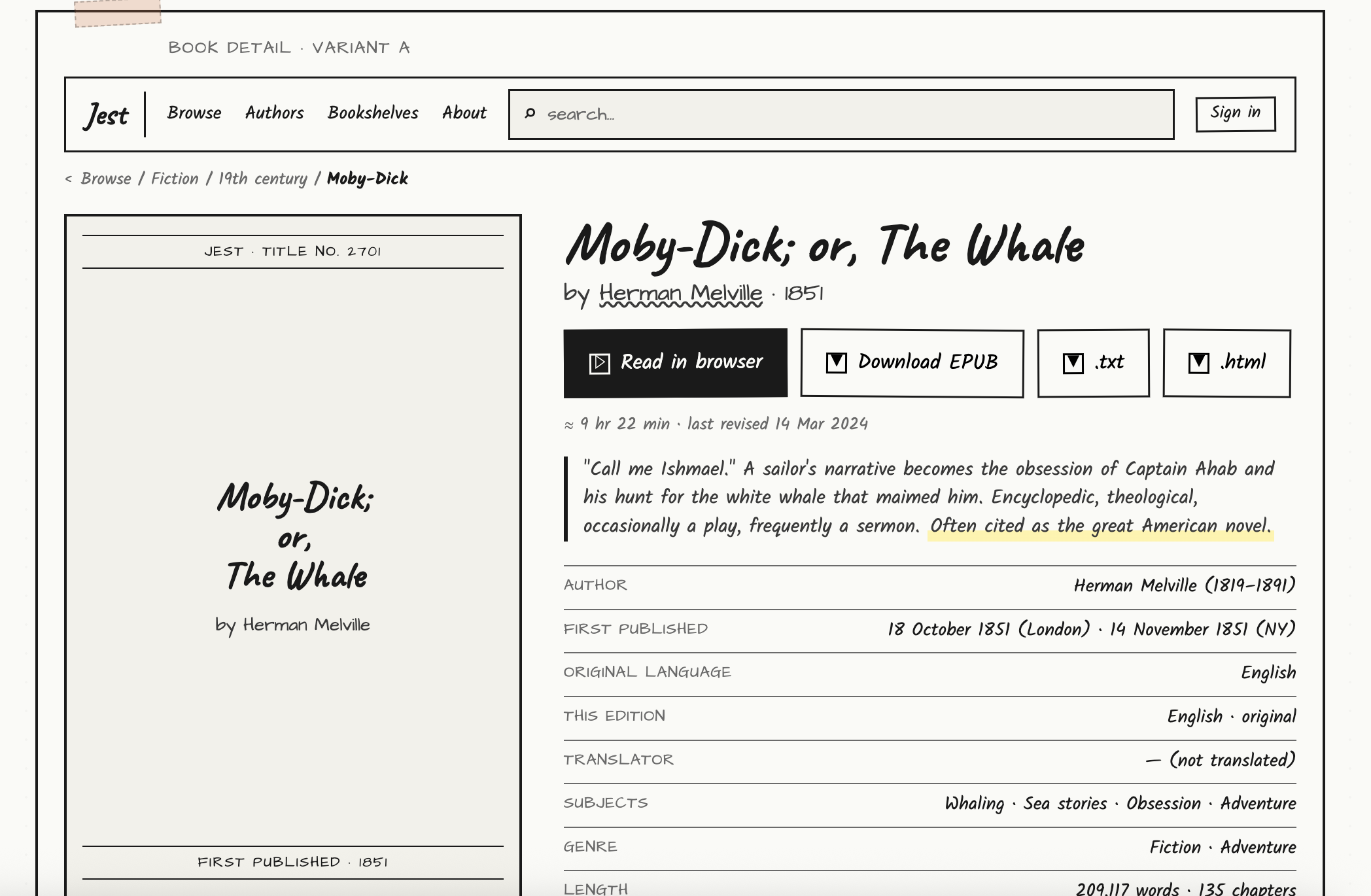
I also put in the same prompt, but used the high fidelity option (along with my recently generated design system)
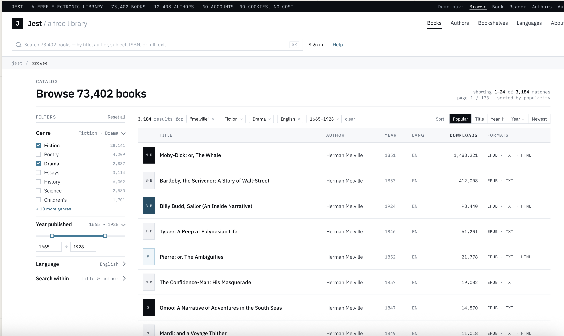
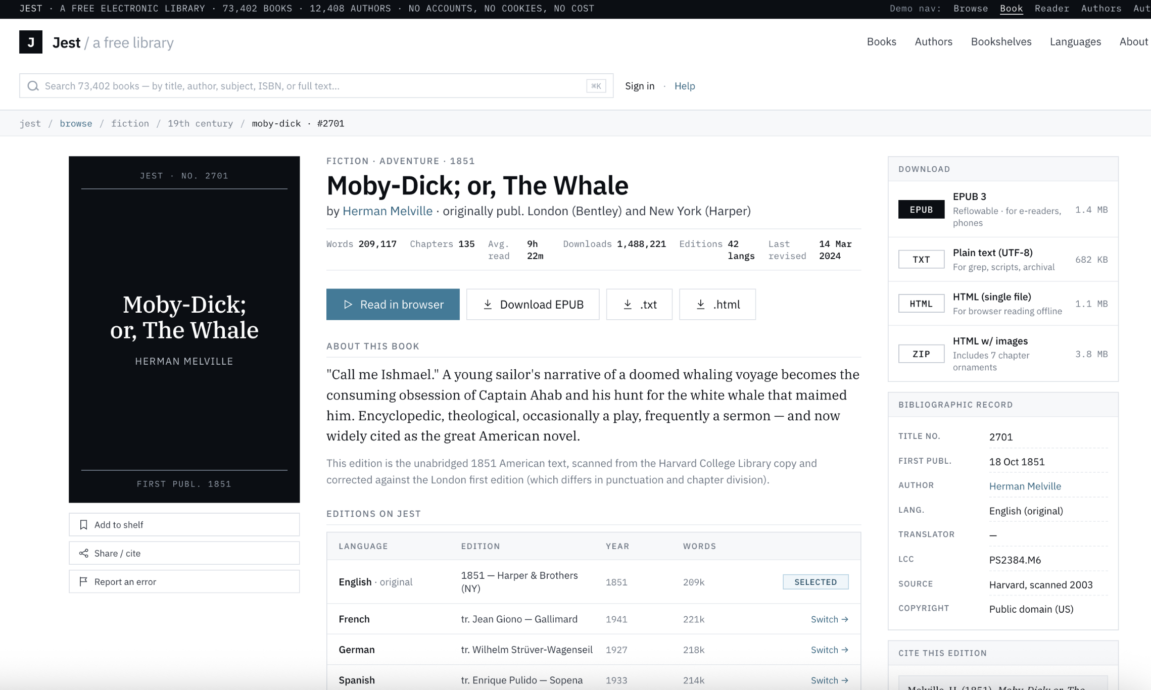
The results were quite nice, and in line with the prompts I gave Claude. The main thing I noticed was that it took a long time to generate the designs.
My Thoughts
Overall, Claude Design gave me pretty decent outputs, but I have mixed feelings on the tool as a whole. It was a much more guided experience than I expected, encouraging the user to start with design systems and wireframes before moving on to high fidelity designs. And for each step of the design, the LLM would follow up with questions and specifics. Instead of just outputting a design system, Claude asks for review on each one of the design elements, and when creating wireframes, Claude asks the user for how many variations to generate, which pages are most important, etc.
I like this guided approach when creating applications, since jumping straight to creating fully polished designs, like Google Stitch seems to encourage, can skip a lot of important steps.
However, as a whole, Claude Design was quite slow. It took something like 10 minutes to generate my first set of wireframes, whereas Google Stitch was able to do so in less than a minute. On top of this, I found the generation features sometimes buggy, they would either not work or take a while to implement a change. The design canvas itself was often hard to navigate and I had a hard time zooming in and out. These are problems that could be fixed pretty soon though, since the tool is in its infancy.
But how necessary is a tool like Claude Design? As a developer, I theoretically could do all of the same things with Claude Code, since after all, both Claude Design and Claude Code use the same underlying model. In fact, I did this with a previous project of mine. I used Claude Code to help me generate user flows, pain point analyses, style guides, wireframes, and eventually, an interactive prototype, and put all of them in a folder called “design-docs” for future reference. All Claude Design does is provide a user-friendly interface on top of the LLM, similar to Claude Cowork. But if you are a developer on a small team, or working by yourself, the cost of generating throwaway code is almost nil at this point. So why not just entirely own the process locally, and use Claude Code to generate the same prototypes and design documents you would be making with Claude Design?
This is supported by the many Claude Code skills and plugins which help create designs that don’t resemble generic AI slop. For example, the famous Anthropic frontend skill, or impeccable.style. There are already solutions out there to help developers create great web designs, utilizing Claude Code. In fact, part of me prefers Claude Code because it is so much more customizable and extensible than a UI generator like Claude Design.
Personally, I’m not sure what the state of web design will be like in a few years. Regardless, I encourage all developers to try out tools like Claude Design and Google Stitch, and see what works for them. One thing is clear though: it is more painless than ever for a developer to create beautiful and usable designs for their applications.