UI Design with Claude Code
Walking through the UX process to design a music review site from scratch
My experience with AI and design
Although I work as a web developer, I’m not excellent at design. I can throw together something in a pinch (especially with the help of styling solutions), but it’s an involved process that takes a lot of effort.
In earlier projects, I sometimes used LLMs to guide my design. However my original method was pretty inefficient. All I did was feed in a list of different features into Claude’s web chat. After asking for further tweaks, and once the design was what I wanted, I reimplemented it locally using my own style solution (ShadCN + Tailwind).
This process wasn’t the best for a few reasons. I had to jump between different chat windows, and after the design was finished on the web, I had to get Claude Code to implement it locally. This meant there was a lot of context switching and repeated work. I also battled with inconsistent styling from one page to another in terms of color, font choices, spacing, etc.
On top of this, there was a more fundamental issue. I had only been using LLMs for a narrow part of web design, which was the actual visual design. I already knew what features I wanted on each page, meaning I was skipping over the process of ideation and iteration, and instead just jumping straight to final designs. In a real project, there would be a lot more uncertainty in terms of the features and overall UX. Ideally, you would first want to start with user stories, then come up with very rough wireframes, iterate on those, before adding styling and reaching a finalized design.
I was curious to test out how far I could use LLMs, specifically Claude Opus 4.6 in Claude Code, to design a site from the ground up, starting with just a vague idea and undergoing the entire UX process.
What do I want to build?
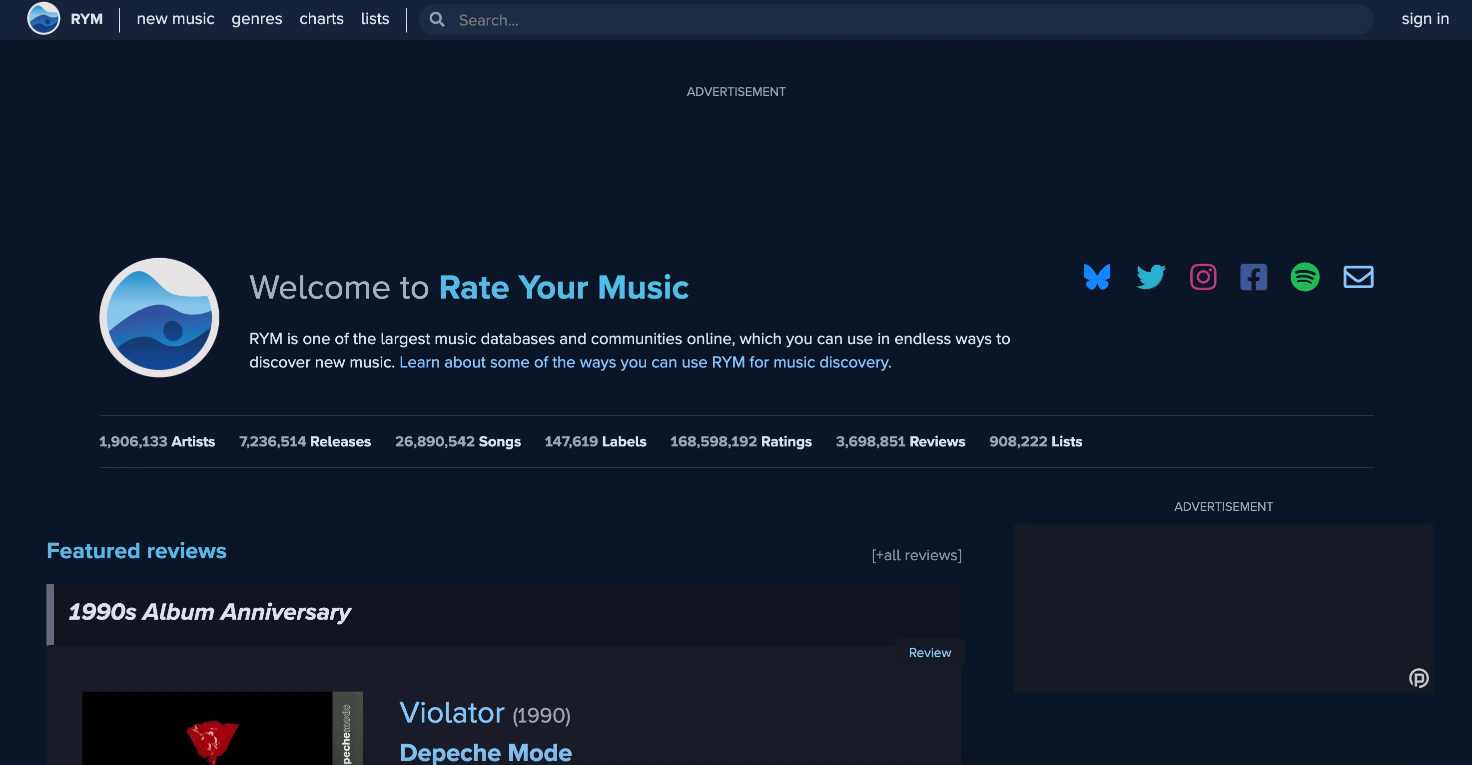
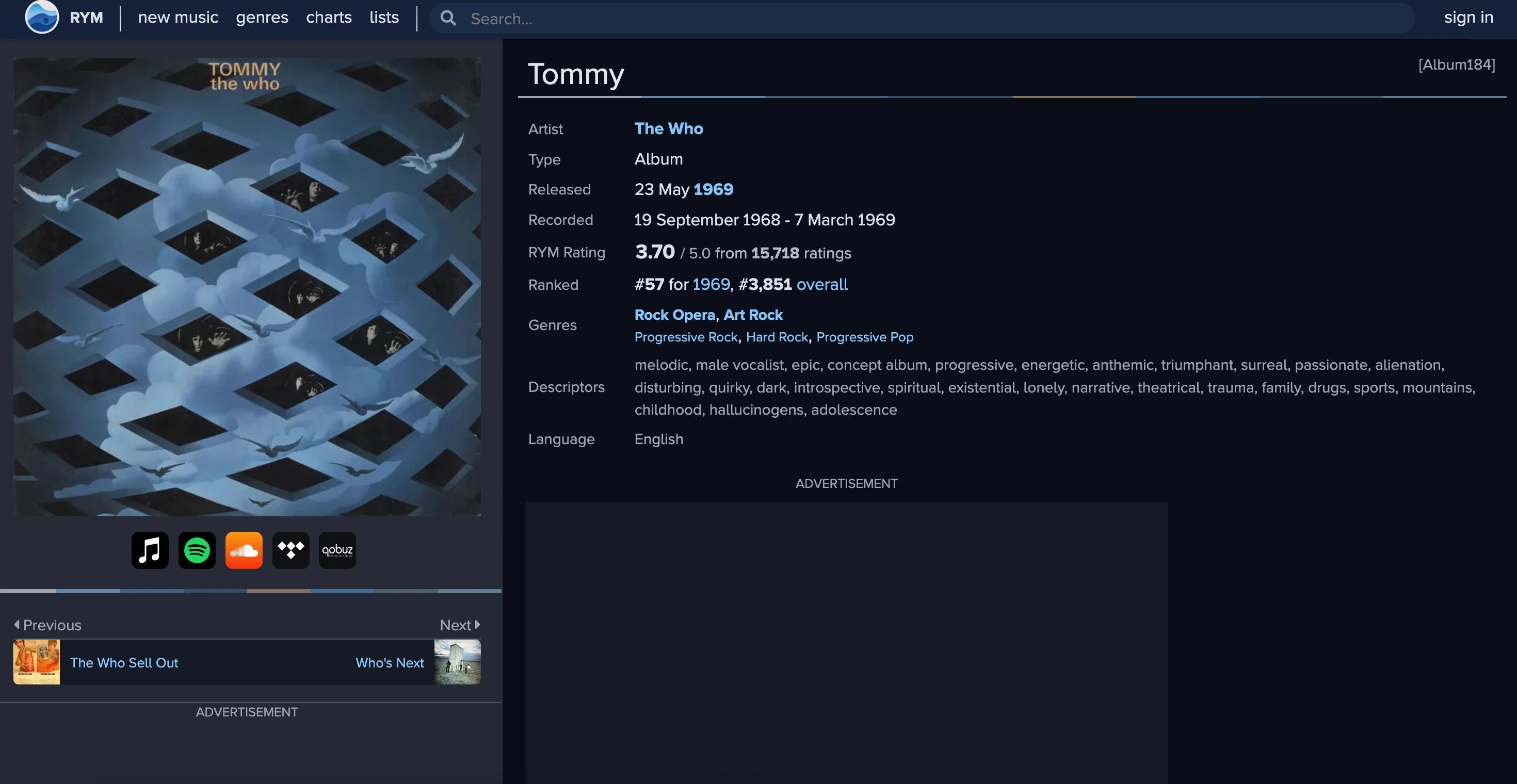
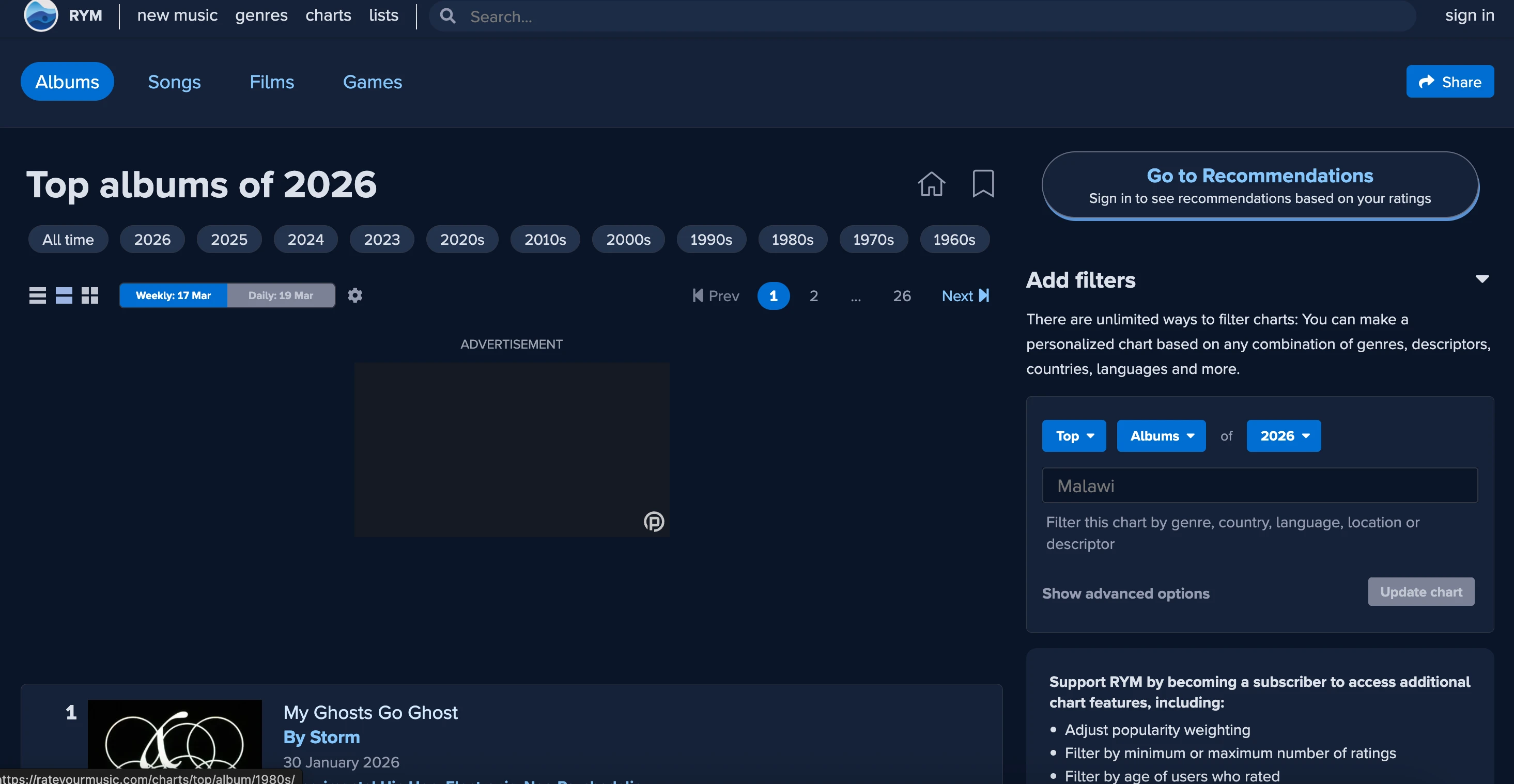
For my redesign, I wanted a site I used frequently. The site in question is www.rateyourmusic.com, which is a repository for user-submitted album and song reviews across a massive range of genres and artists. They also have reviews for films, but I don’t use that portion of the site.
Although I love RYM for looking at reviews of my favorite albums and exploring new music, I find the overall design and layout quite lacking. The navigation is confusing, the spacing and hierarchy on certain pages could be improved, and overall, the design could be made less busy and simpler. In addition, I think RYM has an incredible amount of data, but is sorely lacking in visualizations for it.
So, let’s redesign RateYourMusic from the ground up, enlisting Claude Code as our design partner.
Research
Since this was a redesign, I started by formalizing the list of issues I had with the current design of RYM. I first went through the different pages and wrote down any difficulties I encountered when interacting with the site. I used AI for a small portion of this, taking screenshots of the page and pasting them into Claude’s web chat, but this was just for extra ideas and feedback. Most of the issues listed here are ones that I’ve encountered quite often while using RYM:
Page by page critiques:
- The top part (genres, descriptions, languages) is flat and the subcomponents are hard to immediately identify
- Review experience is buried (underneath ads)
- "Issues" section is kinda irrelevant (and buries the reviews themselves)
- No way to sort reviews, filter, search
- Some of the sections aren't that helpful. "Credits" is not a section I'm that interested in
- Overall, a lot of features that aren't really that important, could be pruned
- Not compact enough (giant header without a lot of usable info)
- Not a pretty design to show the bio
- Very small section dedicated to this person's reviews, that should be the main focus
- Should show favorite genres, highest rated albums, lowest rated albums, etc.
- More analysis here
- Really don't like this. The number one things I'm gonna be doing when visiting the page is to see:
- Top albums
- Most rated albums
- Search for albums
- The discography section is irrelevant, why do I want to paginate through every album ever?
- To see top genre albums of all time, have to click the "see full chart" button
- Brings me to a separate page. Why not have that in the same page?
- Separate page is super confusing, how do I search top country albums in a specific year?
- Cards are too big, would love a concise amount of data so I can quickly navigate through
- Or could do card vs list view (they have this, but it's not by default)
- Make the filters more compact
- More visual hierarchy in the top part (about section), make it more compact
- V/A compilation, appears on, EP vs album are all annoying. Consolidate into just albums and singles
- Sidebar is a bit confusing. I don't think I need that much information here
- This is, for example, top of all time, top of 1991, top emo albums, top songs...
- Might be easier to just consolidate this into 1 page? Current model is confusing
- In the new page:
- Sort by
- Filter (Genre, year or year range, song vs album, etc)
- Replace charts with a "search" page and a bunch of filters
- Makes it way easier to find the above information, don't have to manually search for it
- My version of "lists"
- Simple and to the point, just a description and a list of different albums/songs
- Trending, discover new music (if logged in), log in prompt, new/trending collections
User flow critiques
I also came up with a list of user flows that I tested out, which revealed more problems with RYM.
- Goal: I want to find the best alt-rock albums of all time
- Currently, I actually just google "best alt rock albums rym". On the site itself, I go to music genres in the navbar, there's no way to search. So instead I search for "alt rock" in the searchbar. I see it show up in the dropdown, so I click it. Get to the search results page, where I click alt rock. I see a list of alt rock albums, but I want to see all of them, so I need to click "see full chart".
- In the current flow, it takes a bunch of clicks to actually get to top ranked albums for a specific genre. And even on that page, it's very hard to filter.
- Goal: I want to read some reviews for one of my favorite albums (Either/Or by Elliott Smith)
- I search for "either/or" in the search bar, scroll down to the album results, I click on it, and scroll down to read the different reviews.
- A bunch of extra information that is distracting from the reviews I actually want to read
- Unintuitive way of favoriting the review
- Voting on reviews seems a bit unnecessary
- No title for the majority of reviews, makes it hard to summarize quickly what each review is about
- Goal: I want to find the best (highest rated) albums released in 1978
- Go to charts
- Click "1970s" — doesn't have specific year though, have to scroll down to filters in the right sidebar and filter to 1978 specifically
- Goal: I want to write a review for an album (Rubber Soul by The Beatles)
- Go to the album page
- Find the button for adding a review (hard to find)
After these investigations, I put all of the ideation, user flows, and design critiques in my docs/app-planning folder in the root of the codebase. I can easily review them again in the future and have Claude Code reference them as I implement the features.
Creating the user flows and critiques of RYM’s current design was helpful in identifying areas that could be improved. I didn’t want my design to just be a reskin of the existing product, but theoretically solve real issues present in the platform. Here were some of my key insights from the above documentation:
- RYM is currently too cluttered. There’s a lot of irrelevant features that aren’t appealing to me, and end up being distractions.
- The search feature is confusing, and it’s difficult to find certain albums or artists with given criteria relating to genre, date, sort by, etc.
- The UI design isn’t the best. It could be a lot more intuitive and more compact. Things like colors, padding, font sizes, etc. could use some tweaks to emphasize important features.
- Difficult to navigate to different genres and find related genres.
- No visualization. Enormous amount of very cool data, but there are no interesting graphs or charts.
The redesign
After creating all of these user flows, pain points, and general reviews, now was the time to start the designs. I went to work coming up with a rough set of pages I wanted in my redesign, along with their features and the placement of these features in the app. Basically, descriptions of what these pages would look like, but no actual code written for them, or even sketches.
Google Stitch
Before I go further, I must mention a recent tool released by Google for UI design - Stitch. It’s mor of a 0-to-100 approach, where you simply type in your requirements page by page, and it will generate a design for you (for either mobile or web apps). Without a doubt, it is one of the fastest ways to go from a description to an actual design, so if you are strapped for time and willing to commit to learning a new tool, it’s a great option for handling design work.
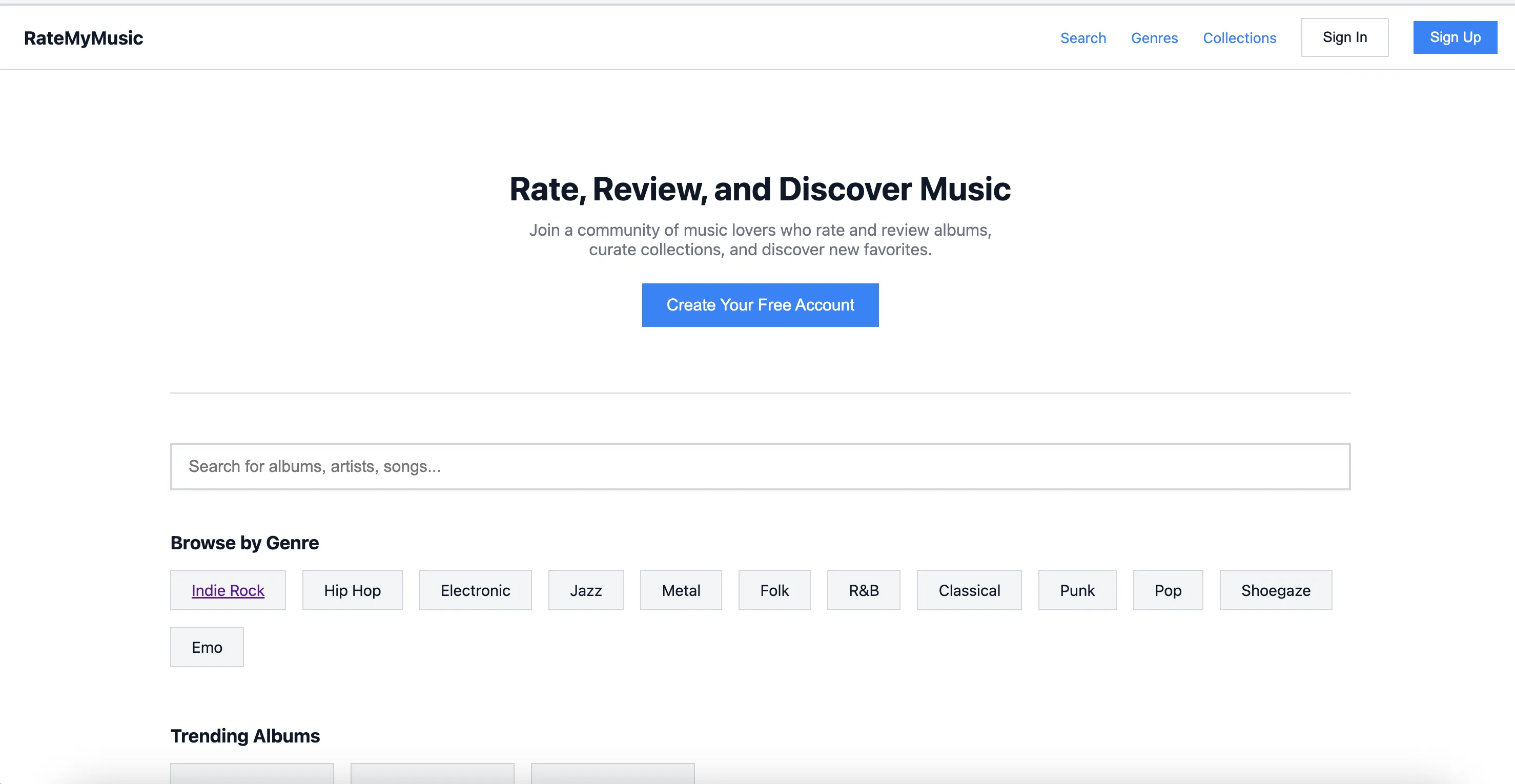
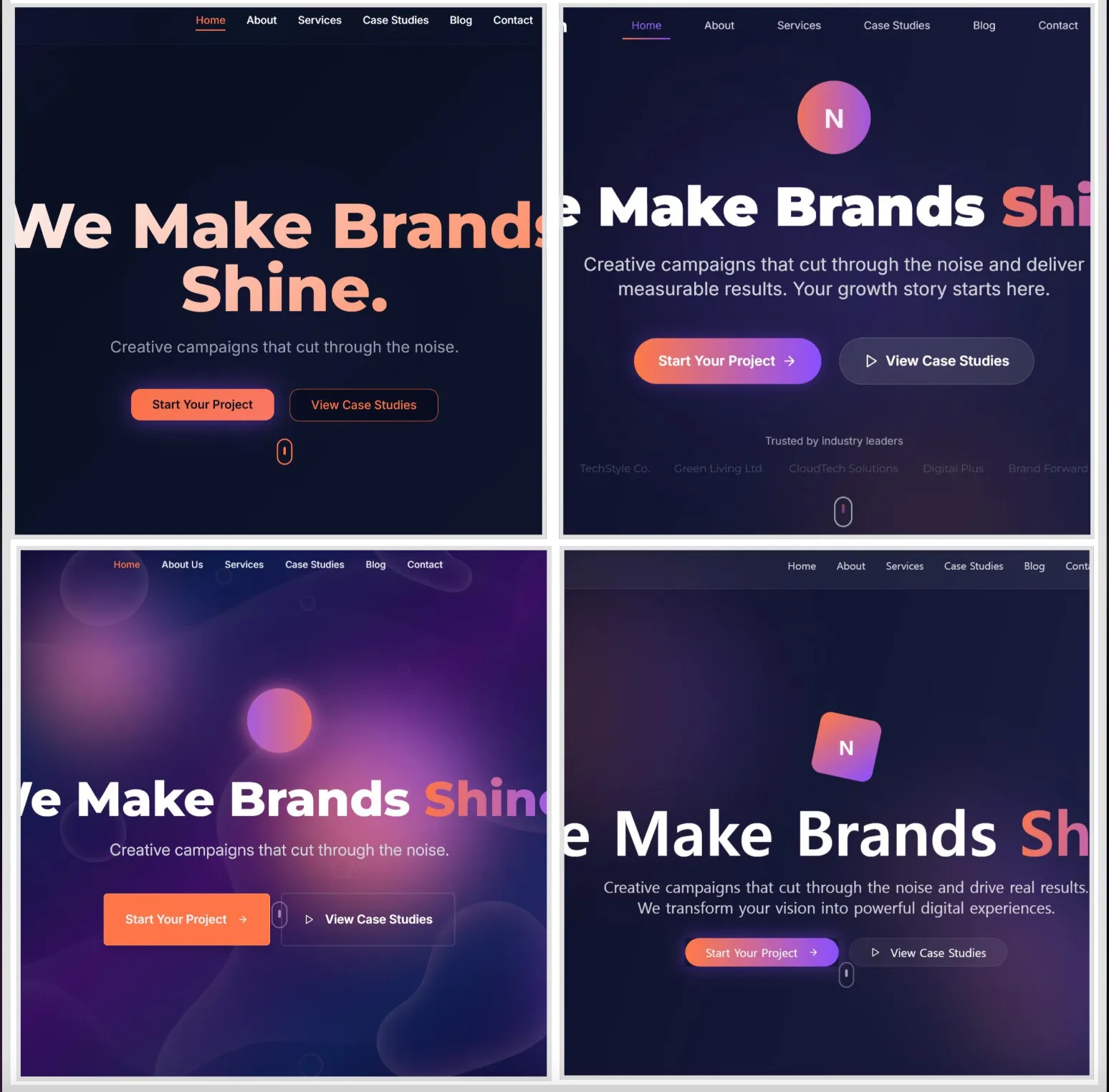
I decided to give it a shot with my RYM redesign. Here are some examples of what it generated for me.
These are high quality designs, and I’ll admit I was impressed with the output! However, there’s some issues in the tool. Firstly with consistency, we can see that the name of the logo changes from one image to another, and same in the footer. There may be a way to address this in the tool itself, I’m not that familiar with it yet and it’s still in beta. There are also features here I did not specify, such as the quick links section in the homepage. So each one of these page outputs needs to be carefully reviewed, but fortunately the tool lets you iterate easily, since you can just tell it to update a page with whatever features you want.
The other problem with this tool is more structural. The designs are nice, but it’s all very overwhelming. I’m still in the process of deciding what features, page layout, and information hierarchy I want, but this tool is now forcing me to consider fonts, colors, and the overall UI design. If you already have a very solid idea of what you want, this may not be a problem, and being able to generate designs like this so quickly mitigates the other issues. But for the purposes of this project, I wanted to be a bit slower and more deliberate with my design process, so while I drew inspiration from some of the pages it generated, I won’t be using them as the final design. In addition, the point of this project is to see how effective Claude Code in particular is at doing web design, and this is another tool I don’t want to introduce into the equation.
Wireframing
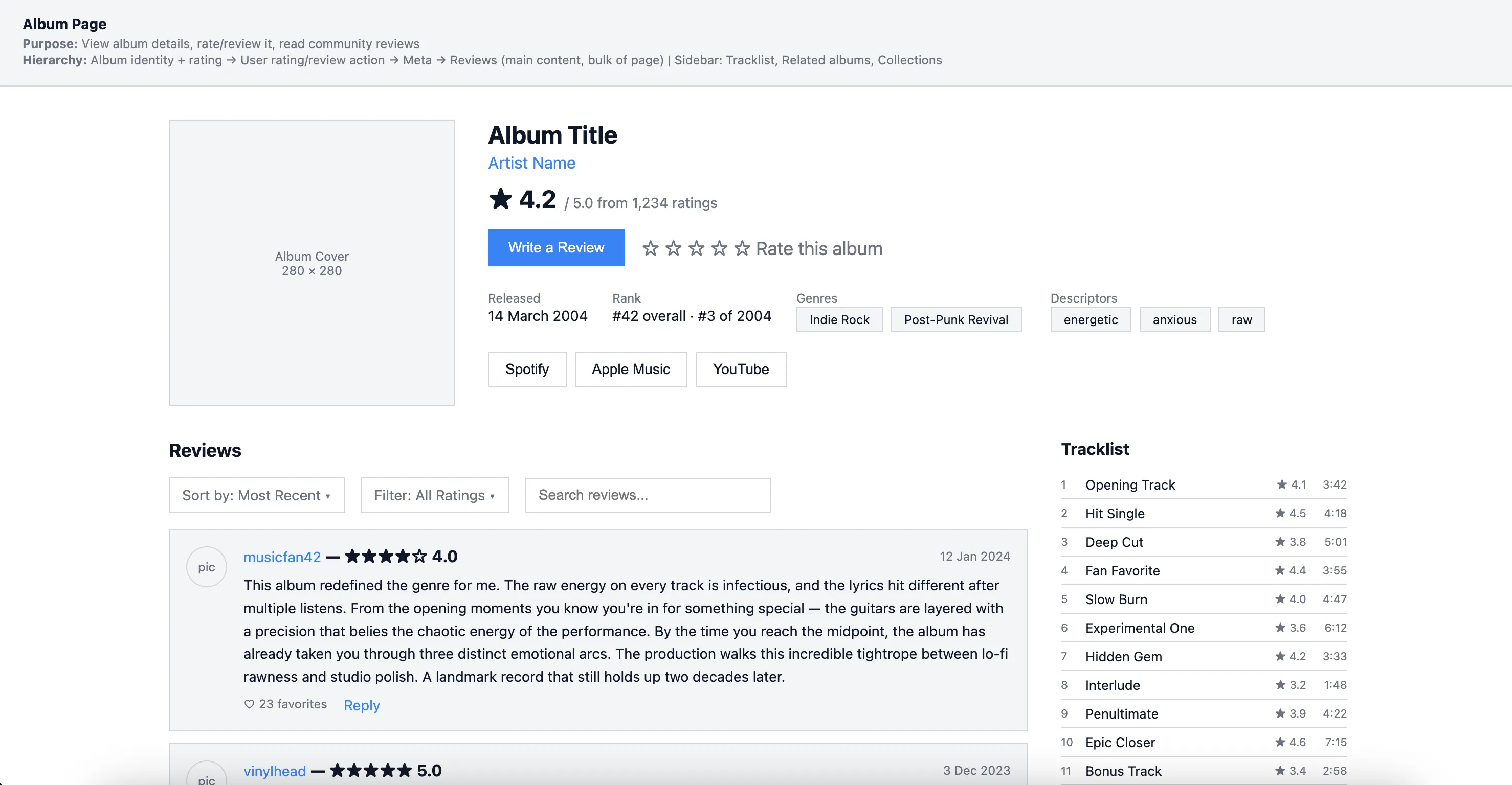
I took my designs and used a custom skill with Claude Code to generate a set of wireframes in my /docs folder. This allowed me to get a rough working draft of what some of the pages would look like. I provided a lot of feedback on my end as well. I considered all of these to be first drafts, and as I was testing them out, told Claude Code to change features as needed. For example: “Can you change this page so it has a sidebar, instead of having all of the information in a vertical list?”, “Can you add some filters for the search?”, “Give me some more ideas for features we could add to this page,” etc. This back-and-forth dialogue between me and Claude was essential in refining the wireframes. Design is supposed to be an iterative process, where you test out and see what does and doesn’t work, and this is much easier with rough wireframes directly in your codebase as opposed to fully fleshed out designs like with Google Stitch.
Here are some of the wireframes we generated together:
And here’s the wireframe index, where I can access any of the pages. All of these are stored in my docs/app-planning/wireframe folder:
The design will continue to evolve as I iterate, tweak, and see what is most usable. But these are perfect for giving me a rough draft that I can use for a basic version of the site.
Implementing the Wireframes
Now that we have our wireframes, we can actually make the app! I decided on using Cloudflare Workers with React Router 7 as my tech stack. For my database, I used SQLite (D1 on Cloudflare’s stack) and Drizzle as my ORM. From there, it was just a matter of implementing the wireframes. I leaned heavily on Claude Code for the implementation, since this is just a toy project.
Along the way I found that certain things didn’t quite work how I wanted, and made design adjustments accordingly. In particular these are some of the changes I made:
- Home page — Most changed. Added: Recommended Albums section, Top Albums by Genre, New Collections, and a sidebar with top-rated content. The wireframe was simpler (value prop → trending → reviews → genres → CTA).
- Trending page — Added a Singles tab (wireframe only had Albums and Reviews).
- Search page — “Songs” tab became “Singles” tab, matching the album-single divide.
- User Profile — Large changes. Added a full Favorites section (albums, singles, artists, reviews, saved collections). Wireframe had taste snapshot with highest and lowest rated; implementation only shows highest rated.
- Genre page — Added breadcrumb navigation for parent genre hierarchy and inline subgenre display. Core layout matches.
- Genre List page — The wireframe planned a full browse page with featured genres grid, search, sort, and pagination. Implementation just redirects to a subgenres view instead.
Creating the website with the wireframes was a great next step because it allowed me to validate my design, create the data model, and interact with the rough draft I had created, to see what did and didn’t work. But this surely isn’t the end of creating new features, and I will continue to iterate until the final version.
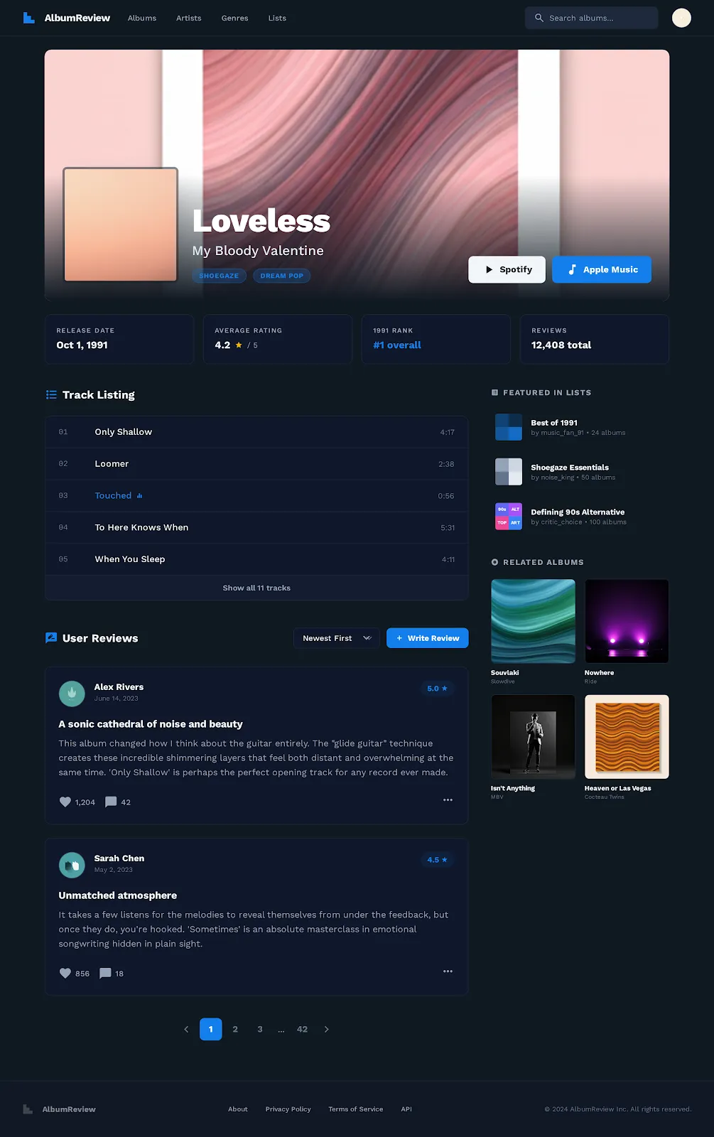
This is what some of the implemented pages ended up looking like!
In short, I removed a lot of the extra features from the original RYM site I didn’t find as necessary, and streamlined the search and genre discovery flows.
The Style Guide
With the actual app implemented, it’s clear the design still requires a lot of work. I’m using basic ShadCN components with Tailwind, meaning this site looks similar to 90% of other ShadCN + Tailwind sites in existence. It certainly doesn’t have much personality to it, which is an issue if my goal is not just solving the usability issues of RateYourMusic, but also creating something that looked nice and had its own distinct identity.
Fortunately ShadCN makes this easy. For those not familiar, the components in ShadCN are copied locally to your codebase, and it’s headless, meaning you can style the underlying components however you please.
I wanted to test out how effective Claude Code would be for this task. However, LLMs have had a lot of mixed reviews when it comes to the styling. There are the dreaded “AI Slop” telltale signs many have noticed when building from the ground up, including cliched purple-indigo gradients, overuse of shadows, and a narrow set of fonts.
I tried using LLMs for design in the past, and did not have as much success, due to lack of consistency and also because the earlier models were not that good.
When researching how to use coding agents for design work, I found an interesting solution. GGPrompts created a large group of style guides in raw HTML and CSS using LLMs, which they published in a convenient handbook. For those not familiar, a style guide is basically a set of rules for how a site should look and feel, including color, spacing, typography, etc. The below videos show some of the style guides they created, each with different aesthetics, for example “Vaporwave”, or “Editorial”. You can check out the full list here.
Here are some of the style guides generated with AI:
Suprematism
Honeycomb
These style guides changed my perception on design work with LLMs. Instead of doing the designs piecemeal and page by page, or component by component, I could start by having the LLM generate a style guide based on specifications, and then apply this styling to all of the app at once. This would save me time, and give me an excellent reference for future conversations with the LLM. I could simply reference the style guide when asking Claude Code to create a new component or graphic.
On top of that, like the GGPrompts, I could actually create a list of different style guides and have a toggle to switch between them! I did a similar thing on a previous app I worked on, www.stuffiminto.com, which lets users switch themes for their personal media review pages:
My first style guide would stay true to the roots of RateYourMusic - an old school internet forum design, with better colors, spacing and visual hierarchy.
In order to do this, I simply wrote a prompt telling Claude Code to create a style guide including typography, colors, and different styled elements in a single HTML document, with inline CSS. I then gave it an overview of the forum style I wanted. You can check out the full prompt below:
But with that done, I also wanted to experiment with other design styles. So I crafted similar prompts for a “soft minimal” style guide inspired by Airbnb, and a “neo-swiss” style. I added a switcher to the navbar so we can toggle between them.
It took some tweaking to get these exactly how I wanted. For example, making sure the fonts were the correct size, that the color contrasts looked alright, etc. But for the most part, it was as simple as telling Claude Code to apply styling changes to each page based on those original style guides I had it write. Using ShadCN made it easy to apply styling changes directly on different components, based on the selected theme.
Conclusion
These are some of the finished pages:
Compact home page with trending albums, genre list, recommended albums, new collections, and top albums by genre.
Unified search page for artists, albums, singles, and users. Find albums from any genre and time period, and sort by number of reviews, avg rating, etc.
A slimmed down, concise page for the artist and album. See what genres they are associated with, mark your favorites, read reviews, and write your own.
A hierarchical representation of genres. The top level (Jazz, Rock, Folk, etc.) all have subgenres, and those subgenre pages can be visited and used to find albums and artists.
See a user's favorites, reviews, and bio.
You can check out the deployed version of the site here: https://rate-your-music.christechprojects.com/
In conclusion, this was a great way to validate my earlier feelings about using AI in design. You can avoid AI slop designs by building your own style guide from scratch. And you can go far beyond that by creating wireframes, ideating, and identifying pain points with the help of Claude Code.
That being said, I’m not sure all of this was super necessary. For larger projects, there’s a good chance you will have actual designers who know what they are doing, and the final designs will be of much higher quality. And for smaller projects, you will probably already know what features you want and implementation speed will be a priority, in which case Google Stitch might be a better pick.
Either way though, this was a fun project, and I’m excited to keep using AI in my design process. The designs for the music forum were alright, but I have no doubt I could create even better ones as my fluency with AI continues to improve.